While out visiting Jeff's family for Thanksgiving, Jeff and I ventured into Seattle on Saturday and spent the day checking out sites, both new and familiar. One of the sites that was new to both of us was the Central Library of the Seattle Public Library system. The library, designed by architects Rem Koolhaas and Joshua Ramus, opened in 2004 to much acclaim and a couple of dissenting voices. It's hip, modern, and nothing like how you expect a library to appear.
 Credit: Seattle Public Library Web site. (It was cold outside and we didn't think to stop and take a photo.)
Inside, the building teems with cool features. The first thing we noticed was a overhead book handling system that was completely high-tech, taking returned books and automatically sorting them based on where in the library they belong. Then we noticed the interesting art installation on the floor--556 lines of raised text in 11 languages found in the library's collection. The text is reversed "to reference both how books are produced and how we learn to read from symbols that are at first unknown to us." Also on Level 1 and rising upward all the way to Level 3 (Level 2 is a staff only floor) is a huge auditorium used for readings, performances, etc.
After peeking around Level 1, we hopped on the escalators, which are a crazy neon green color. Impossible to miss.
Level 3 houses popular books and two things which seem pretty unique to me, at least as far as libraries go. One is a coffee/sandwich cart. My entire life eating in a library has been a big no-no, but here it's actually encouraged. Although, to be fair, you can't take the food out of this little area. Additionally, there was a gift shop that didn't sell used books but instead featured an eclectic array of items for the book lover that was, for the most part, not at all stuffy or intellectual, but in fact rather lighthearted and humourous.
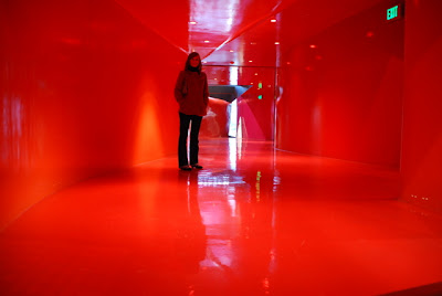
Now Level 4 is the location of meeting rooms, but we're not talking your typical library meeting room. You know, the dark, dank, and dull meeting rooms common to most libraries and all too often tucked away in the basement. No, this Level's circular corridors are painted bright, bright red. It was very funky and space-agey.
 Don't worry. The meeting rooms are painted in neutral colors.
Level 5, for reasons I'm not sure of, is referred to as the mixing chamber. It's really more of a multi-media floor with hundreds and hundreds of computers available for public use. A large librarian's desk is also on this floor and overhead is an electronic installation that shows what's being checked out...kind of a tally of what's being read in Seattle.
The bulk of the library's collection can be found on Levels 6-9. These levels actually spiral upward with each row a tiny bit higher than the row before it. The slope is really gentle, so much so that you don't actually realize you're walking up a ramp, but if you browsed the collection from the beginning of the Dewey Decimal System to the end, you'd actually rise three floors. How cool is that? Also, unlike in other libraries where you have to get up close to each row to see what Dewey Decimal numbered books can be found down it, in this library you can tell from fairly far away thanks to big floor mats at the end of each row with the relevant numbers on them.
The top floor, Level 10, is a reading room with study tables and comfy lounging chairs. It's also the place to go for the best views. Through the glass, you can peer out at the city.


You can also go out on a small landing and peer down at the library below you. It was intensely dizzying (I don't think you'll ever catch me bungee jumping) but really cool.

You could also get a view of the video projection by artist Gary Hill, which is installed on the white atrium wall. Although we were more intrigued by the cool patterns the ceiling projected as the sun played peek-a-boo through the clouds.

 In this second image, you can see the video projection, although not very well.
Art-wise, I was much more intrigued by the video sculptures by Tony Oursler, which are in the wall of the escalator between Levels 3 and 5. I was too busy checking it out to take a picture, but here's one I co-opted from the Web.
I didn't realize the library would be so interesting and something I'd want to write about on my blog, so I didn't take as many pictures as I wish I had. (Plus inside photography is hard.) I encourage you to go the Seattle Public Library website to check out their slideshow of images. And if you're ever in Seattle, be sure to check it out. I can pretty much guarantee that you've never seen a library like this before.
After peeking around Level 1, we hopped on the escalators, which are a crazy neon green color. Impossible to miss.
Level 3 houses popular books and two things which seem pretty unique to me, at least as far as libraries go. One is a coffee/sandwich cart. My entire life eating in a library has been a big no-no, but here it's actually encouraged. Although, to be fair, you can't take the food out of this little area. Additionally, there was a gift shop that didn't sell used books but instead featured an eclectic array of items for the book lover that was, for the most part, not at all stuffy or intellectual, but in fact rather lighthearted and humourous.
Now Level 4 is the location of meeting rooms, but we're not talking your typical library meeting room. You know, the dark, dank, and dull meeting rooms common to most libraries and all too often tucked away in the basement. No, this Level's circular corridors are painted bright, bright red. It was very funky and space-agey.
 Don't worry. The meeting rooms are painted in neutral colors.
 Level 5, for reasons I'm not sure of, is referred to as the mixing chamber. It's really more of a multi-media floor with hundreds and hundreds of computers available for public use. A large librarian's desk is also on this floor and overhead is an electronic installation that shows what's being checked out...kind of a tally of what's being read in Seattle.
The bulk of the library's collection can be found on Levels 6-9. These levels actually spiral upward with each row a tiny bit higher than the row before it. The slope is really gentle, so much so that you don't actually realize you're walking up a ramp, but if you browsed the collection from the beginning of the Dewey Decimal System to the end, you'd actually rise three floors. How cool is that? Also, unlike in other libraries where you have to get up close to each row to see what Dewey Decimal numbered books can be found down it, in this library you can tell from fairly far away thanks to big floor mats at the end of each row with the relevant numbers on them.
The top floor, Level 10, is a reading room with study tables and comfy lounging chairs. It's also the place to go for the best views. Through the glass, you can peer out at the city.


You can also go out on a small landing and peer down at the library below you. It was intensely dizzying (I don't think you'll ever catch me bungee jumping) but really cool.

You could also get a view of the video projection by artist Gary Hill, which is installed on the white atrium wall. Although we were more intrigued by the cool patterns the ceiling projected as the sun played peek-a-boo through the clouds.

 In this second image, you can see the video projection, although not very well.
 Art-wise, I was much more intrigued by the video sculptures by Tony Oursler, which are in the wall of the escalator between Levels 3 and 5. I was too busy checking it out to take a picture, but here's one I co-opted from the Web.
I didn't realize the library would be so interesting and something I'd want to write about on my blog, so I didn't take as many pictures as I wish I had. (Plus inside photography is hard.) I encourage you to go the Seattle Public Library website to check out their slideshow of images. And if you're ever in Seattle, be sure to check it out. I can pretty much guarantee that you've never seen a library like this before.


4 comments:
Just an architectural note here: For those of you that don't already know, Joshua Prince-Ramus is the principle architect for Louisville's Museum Plaza. He left Koolhaus' OMA (Office for Metropolitan Architecture) and founded his own firm REX. (End of architectural nerdiness)
From the pictures (both yours and others) it definitely looks like an interesting piece of architecture. Even so, with a large collection of books housed there, it will still probably make me ill.
This was still being built when I left Seattle so I never got to see it until the last time we were there in August. I was also really impressed... it's definitely a place where I would have spent a lot of time if it was there when I was a student. The awesome thing was that they let us use the internet there absolutely free even though we weren't residents and didn't have library cards. They just let us log on as visitors, which was really nice :)
From the outside(judging by the pic), it looks like an oven vent made out of diamond plate for a for standing range.
I'm jealous. If the library in Seattle is that artsy, I can only imagine what the rest of the city is like! Very cool indeed. Puts Cincinnati to SHAME.
Post a Comment